cd/ui
React components you install right into your project, and you can see how much each one weighs.
- React
- TypeScript
- Base UI
- Tailwind v4
- shadcn registry
- Zod
tl;dr#
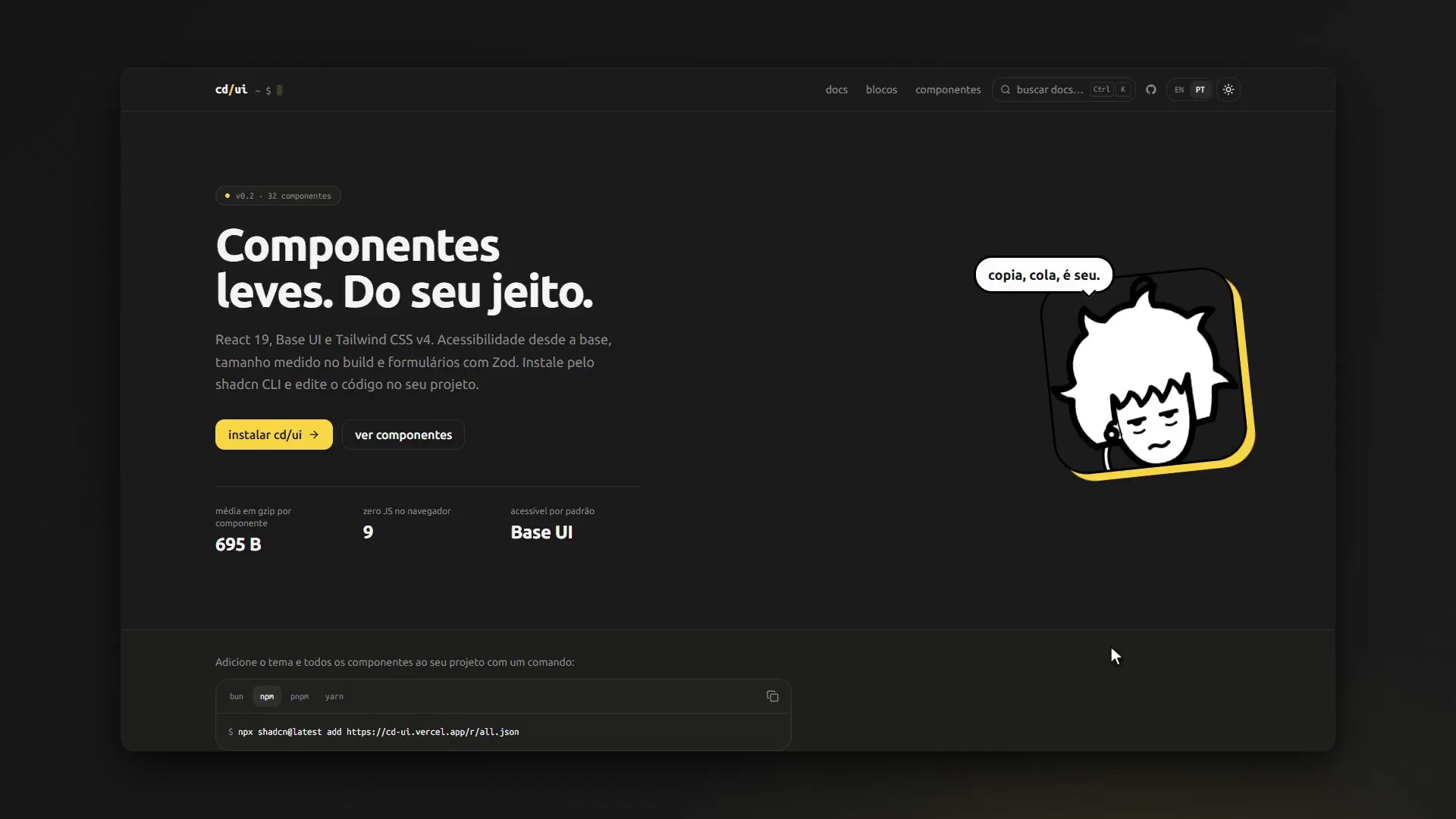
cd/ui is 32 React components and 15 blocks (ready-made screens), all on Base UI + Tailwind v4, as a shadcn registry. You drop the code straight into your project and tweak it however you want. Every build measures each component’s gzip size; right now the average is about 695 B.
docs · blocks · performance · code
the problem#
a component library is usually a dependency: you install it, import it and hope it keeps doing what you need. when some detail has to change, you end up fighting its API or its CSS.
and pretty much every library says it's "lightweight". almost none tells you how much.
I wanted the opposite:
- accessible components that become my own code, not a dependency;
- the weight of each one measured, not guessed;
- as little JavaScript in the browser as I can get away with.
the idea#
three simple bets:
- a registry instead of a package. cd/ui never goes into
node_modules. one command copies the component file into your project, and from then on the code is yours. - measure at build time. the size comes from esbuild, not from an estimate, and it shows up on every docs page.
- server first. a component with no state is a Server Component and ships no JS.
"use client"only shows up when there's state or events.
what it looks like#
no shadcn init needed. you create a tiny components.json:
{
  "style": "new-york",
  "tailwind": { "css": "src/app/globals.css", "baseColor": "neutral" },
  "aliases": { "components": "@/components", "utils": "@/lib/utils" }
}
and one command installs the theme, utils and every single component:
npx shadcn@latest add https://cd-ui.vercel.app/r/all.json
blocks have all-blocks.json. single items work too, by URL or by registering the namespace in components.json:
{ "registries": { "@cd": "https://cd-ui.vercel.app/r/{name}.json" } }
npx shadcn@latest add @cd/button @cd/dialog
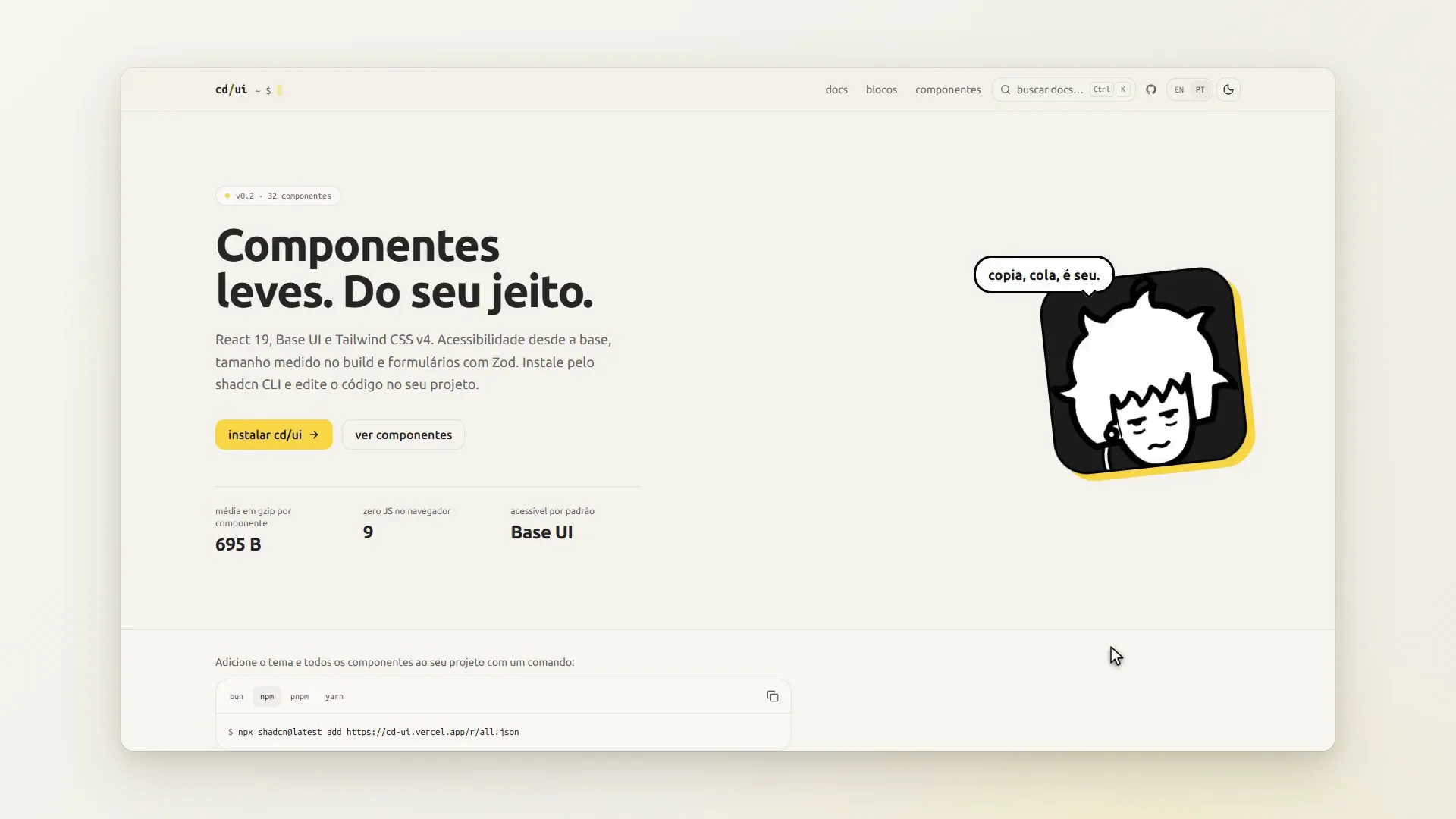
the dependencies (Base UI, and Zod when needed) and any other components it uses come along for the ride. and the home page already gets the idea across.
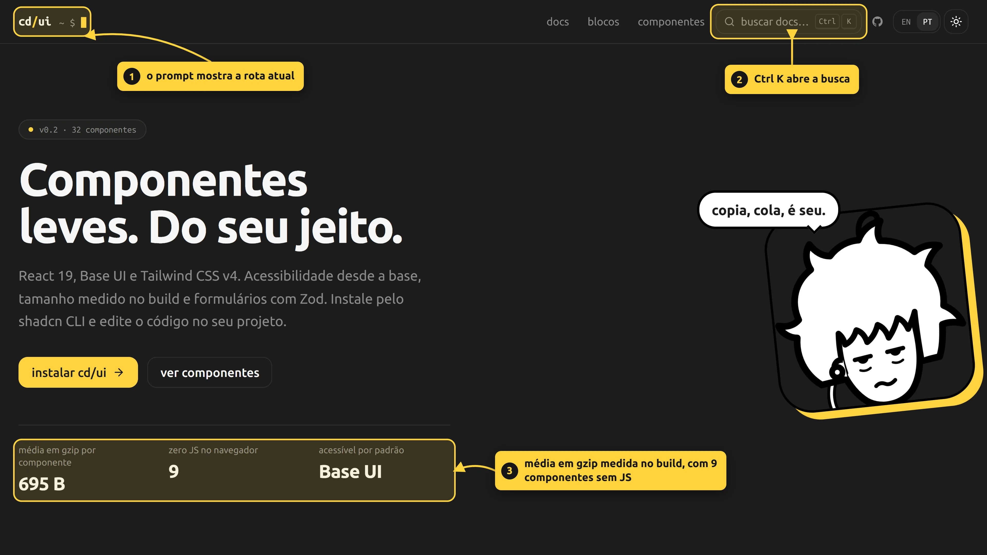
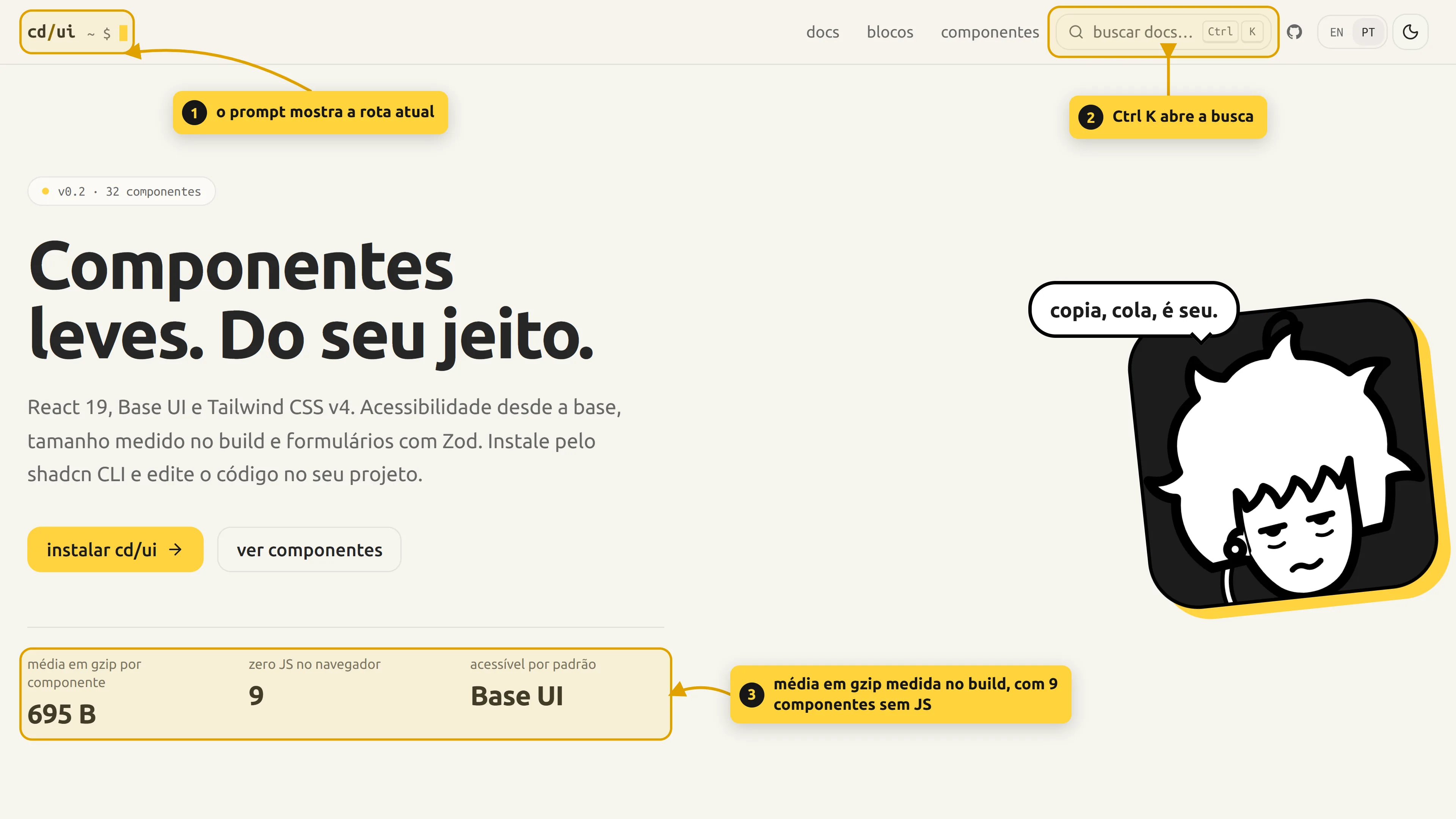
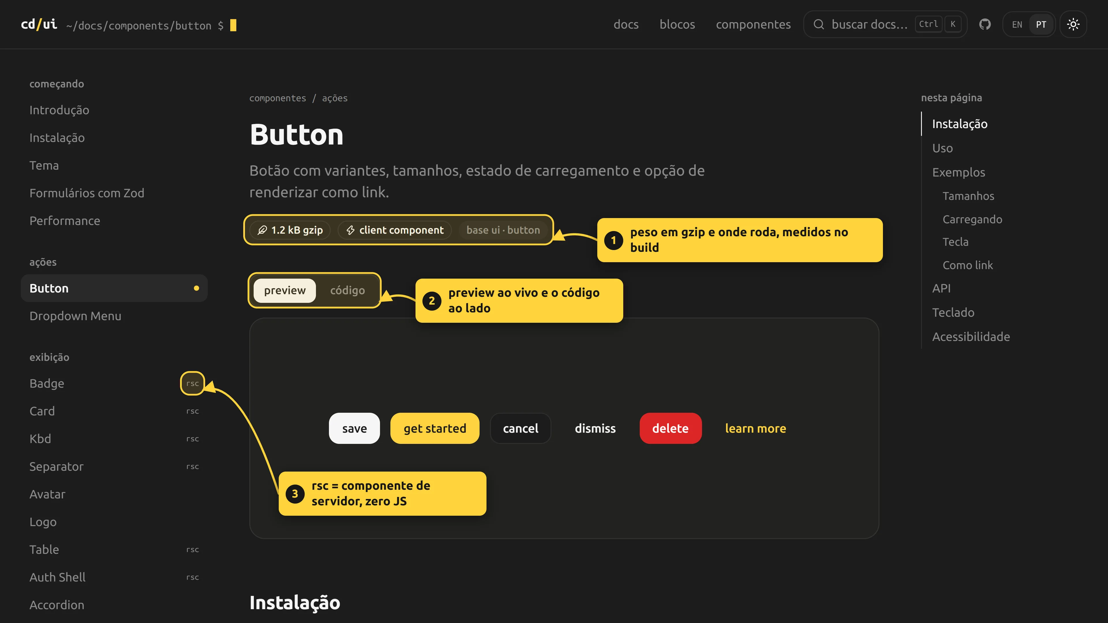
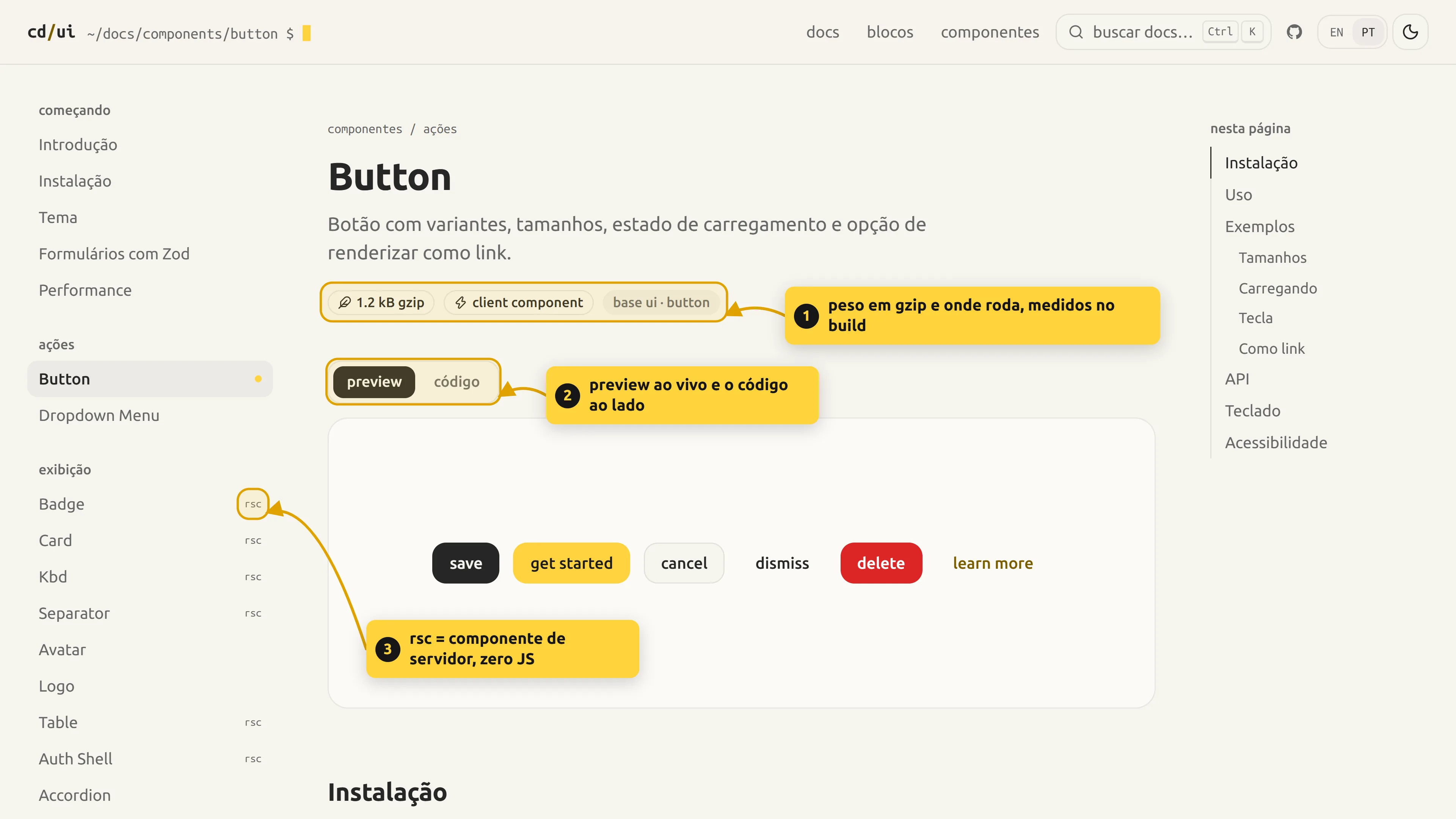
every component has its own page, with preview, code, API, keys and accessibility notes. the size badge and the client/server badge come from the build measurement.
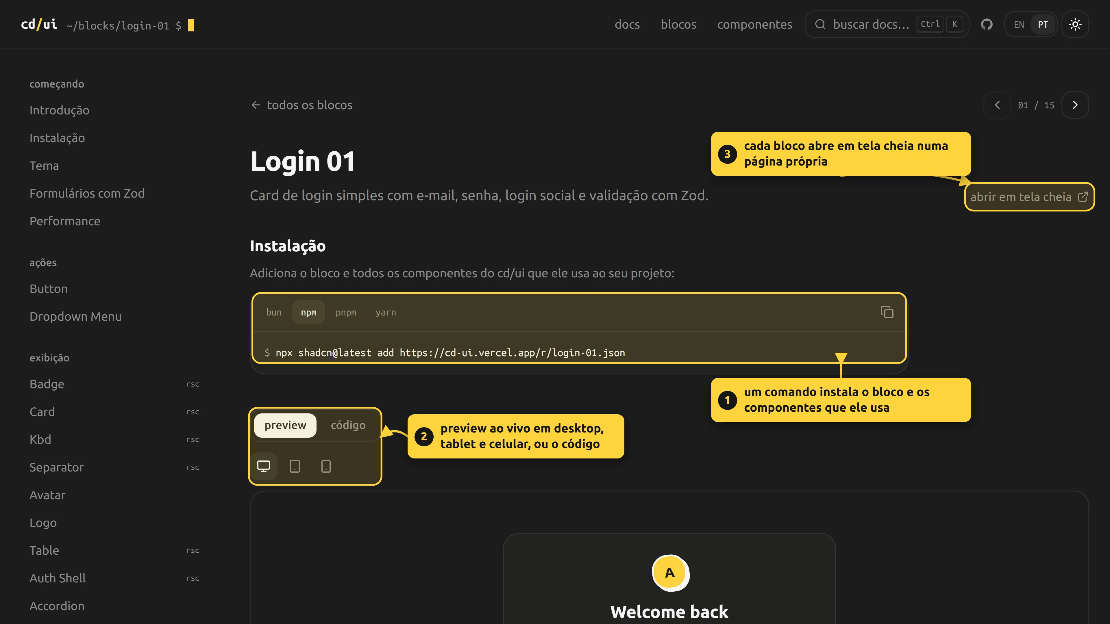
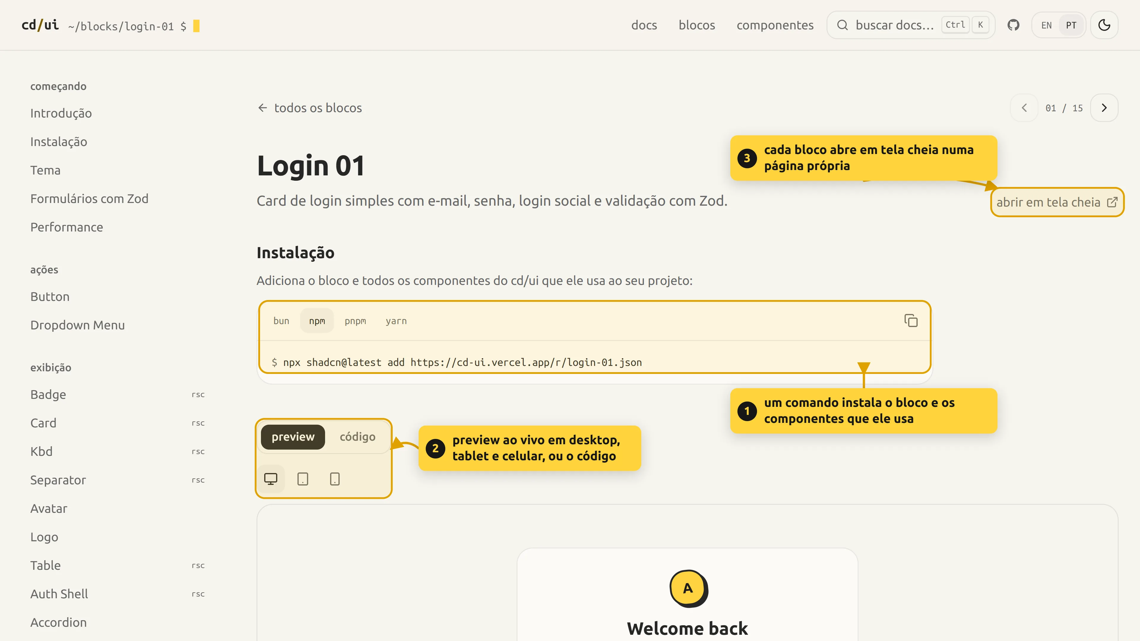
on top of the components, cd/ui has 15 blocks: full ready-made screens (5 for auth, 7 for marketing and 3 for apps, like login, hero, pricing, FAQ and settings), built only from the library's own components. a block installs with one command and pulls in the components it uses:
npx shadcn@latest add https://cd-ui.vercel.app/r/login-01.json
each block page shows the preview at desktop, tablet and phone sizes, the code, and opens full screen. the docs and the blocks exist in Portuguese and in English.
how it works under the hood#
the repository has two sources of truth: the files in src/registry/cd/ui/*.tsx (what gets distributed) and src/docs/catalog.json (name, title, category and description of each component). blocks follow the same scheme, in src/registry/cd/blocks and src/blocks/catalog.json. the build reads all of it and generates what the site and the CLI need.
src/registry/cd/ui/*.tsx ─┬─► build-registry.mjs ─► registry.json ─► shadcn build ─► public/r/*.json
                          │
                          └─► metrics.mjs ─► esbuild + gzip ─► src/docs/metrics.json ─► docs
bun run build runs registry:build (both scripts and shadcn build) and only then next build.
nobody writes the registry by hand#
scripts/build-registry.mjs finds the dependencies by reading the file's own imports:
function importsOf(file) {
  const src = readFileSync(file, "utf8");
  return [...src.matchAll(/^import\s+(?:type\s+)?[^"']*["']([^"']+)["']/gm)]
    .filter((m) => !/^import\s+type\s/.test(m[0]))
    .map((m) => m[1]);
}
anything that isn't @/ or react becomes an npm dependency. anything under @/registry/cd/ui/other becomes a registry dependency (the URL of the other component). the theme item copies the tokens from globals.css, the :root and .dark blocks.
bottom line: if a component starts importing something else, the registry already knows. there's no list to forget to update. the same goes for blocks: the components they import become registry dependencies, so installing a block installs everything it uses.
what I learned installing it into a real project#
when I installed cd/ui into a project outside the repo, four problems popped up that my own site never showed me:
cnwas shadcn's. without a URL forutils, shadcn falls back to its built-in item, which installsexport { cn } from "cn". now cd/ui ships its ownutilsitem (clsx + tailwind-merge) and every component depends on it.- Server Components couldn't call
buttonVariants. it lived inbutton.tsx, which is"use client", and a function exported from a client module doesn't run on the server. it moved tobutton-variants.ts, with no"use client", andbutton.tsxjust re-exports it. in the registry, sibling files a component imports that aren't in the catalog travel in the same item. - without
components.json,adddoesn't do what it looks like. in an empty app it dumps the files in the current folder and doesn't touch the CSS, and the interactive mode offers aninitthat pulls in shadcn's defaults (tw-animate, its tokens). that's why the tinycomponents.jsonis the step that actually matters. - blocks import from the registry path. they use
@/registry/cd/ui/buttonand the CLI rewrites that path to the alias in thecomponents.jsonof whoever installs.
how the weight is measured#
scripts/metrics.mjs bundles each component with esbuild and measures it in gzip:
const result = await build({
  entryPoints: [file],
  bundle: true,
  minify: true,
  write: false,
  format: "esm",
  // libraries stay out; cd/ui's own code goes in
  external: ["react", "react/*", "react-dom", "@base-ui/react", "@base-ui/react/*", /* … */ "zod", "zod/*"],
});
const code = result.outputFiles[0].contents;
metrics[name] = { gzip: gzipSync(code, { level: 9 }).length, /* … */ };
the libraries are left out on purpose: Base UI and Zod already live in your project or are shared. the number is the code that enters your project on top of them, which is the part cd/ui controls.
the same script flags each component as client or server just by checking whether the file starts with "use client":
client: /^["']use client["']/.test(source),
the numbers on the site come from that measurement. all 32 components, smallest to largest:
| component | gzip | runs on |
|---|---|---|
| skeleton | 234 B | server |
| kbd | 282 B | server |
| separator | 284 B | server |
| card | 377 B | server |
| avatar | 383 B | client |
| spinner | 398 B | server |
| textarea | 451 B | client |
| field | 451 B | client |
| badge | 453 B | server |
| progress | 465 B | client |
| popover | 478 B | client |
| radio-group | 522 B | client |
| input | 525 B | client |
| otp-input | 539 B | client |
| form | 553 B | client |
| auth-shell | 573 B | server |
| tabs | 613 B | client |
| switch | 660 B | client |
| slider | 667 B | client |
| checkbox | 688 B | client |
| alert | 776 B | server |
| tooltip | 794 B | client |
| pricing-toggle | 885 B | client |
| dialog | 898 B | client |
| accordion | 912 B | client |
| table | 930 B | server |
| dropdown-menu | 1.0 kB | client |
| logo | 1.1 kB | client |
| button | 1.2 kB | client |
| select | 1.2 kB | client |
| toast | 1.3 kB | client |
| password-input | 1.7 kB | client |
average of about 695 B. 9 of the 32 (alert, auth-shell, badge, card, kbd, separator, skeleton, spinner and table) ship no JS.
Zod forms without loading all of Zod#
Form only imports Zod's core, zod/v4/core:
import { type $ZodObject, flattenError, type output, safeParse } from "zod/v4/core";
so it accepts schemas from zod and from zod/mini. you pass the schema, give the Fields a name, and each field validates its own schema key when you leave it:
const validateField = (name: string, value: unknown) => {
  const field = schema._zod.def.shape[name];
  if (!field) return null;
  const result = safeParse(field, value);
  return result.success ? null : result.error.issues.map((issue) => issue.message);
};
on submit the whole schema runs. if it fails, the errors go to each field's FieldError. if it passes, onSubmit receives the data already converted and typed by the schema:
const schema = z.object({
  email: z.email("invalid e-mail"),
  age: z.coerce.number().min(18, "must be 18+"),
})

<Form schema={schema} onSubmit={(values) => {
  values.age // number, not string
}}>
  <Field name="email">…</Field>
  <Field name="age">…</Field>
</Form>
decisions#
copy instead of depend. a component is just a file of yours. if the button needs another variant, you edit the file and that's it. the catch is that updating later is on you.
Base UI underneath. focus, keyboard and aria come from Base UI. cd/ui adds the look and the variants on top, and every component page lists the keys and the accessibility notes.
import only what it uses. each component imports the part of Base UI it needs (@base-ui/react/dialog), never the whole package. animations, the textarea growing and the spinner are CSS.
motion with a reason. the button sinks 2% in 80 ms when clicked. in general it's 80 to 240 ms, strong curves, only transform and opacity, and prefers-reduced-motion respected in all of them. search (⌘K) opens and closes with no animation at all: if you use the shortcut, you open it hundreds of times a day.
the prompt is the logo. the docs header shows cd/ui ~/docs/button $ with a blinking cursor: the text is the logo and it also tells you which page you're on.
the component name is validated. the name becomes a file path and a URL, so the build only accepts lowercase letters, numbers and hyphens (/^[a-z][a-z0-9-]*$/).
what changed later#
- performance. jumping between docs pages felt slow. looking at the build output, every route was dynamic (ƒ,
no-store) because the root layout read the locale from a cookie. the locale became a route segment ([locale]), read from params: now every page is static, CDN-cached for 1 year and navigation is prefetched. lazy-loading search only saved ~4 KB (Base UI was already in the shared chunks). the real win was making the pages static. - motion and radius tokens. durations were hardcoded in each component (about 20 files). now they're
--cd-duration-instant/fast/base/slow(80/120/160/240 ms),--cd-ease-outand--cd-scale-enter, with a singleprefers-reduced-motionblock and acd-popuputility for the 5 popups. overriding a token in:rootretunes everything, or one component with[--cd-duration-base:300ms]. I dropped tw-animate-css, which was imported and nobody used. the old radius scale (6/8/10/14/18 px) made everything look the same: now it's a 12 px base with 4/6/9/12/18/24, plus--radius-buttonand--radius-field. - Select felt janky. Base UI's default
alignItemWithTriggermade the popup jump over the trigger depending on the selected item. I turned it off by default (it's still a prop), with the check on the right and a visible highlight. - signature pieces. a "prompt tree" accordion (a ▸ marker that turns, a brand rule on the open item; the old chevron is still there), alert as a terminal log line (
[warn] disk almost full - 14 GB left,role="alert"only for warn and error), akeybutton variant inspired by Kbd, a Material-style tooltip with aTipwrapper, SwitchRow (the whole row is clickable), a table with numeric, density and sticky header, Logo, and PasswordInput, OtpInput, AuthShell and PricingToggle extracted from the blocks.
status and next steps#
cd/ui is at v0.2, with 32 components, 15 blocks, light and dark themes and the docs site live, in Portuguese and English. it's open source: MIT license, a contributing guide and CI that runs lint, types and build on every pull request. to be upfront about the measurement: it counts cd/ui's code, not the Base UI or Zod that come with it.
adding a component is quick: the file in src/registry/cd/ui, the catalog entry, the examples and the docs, and bun run registry:build generates the rest.