screenshots that explain: how I made the annotated captures for my portfolio
Playwright driving Edge, an overlay with labels and arrows injected into the real page, a 4K capture, and why the old screenshots looked blurry
8 minview on github
tl;dr#
the case studies on my portfolio have screenshots with numbered labels, arrows and outlines pointing at what matters. I don't draw those in an image editor: a Playwright script opens the real app in Edge, injects an overlay (SVG + divs) on top of the page and captures with deviceScaleFactor: 3, which gives a 3840x2160 image. the old screenshots looked blurry because I was squeezing a 1280px page into a 608px column. the fix wasn't just more pixels: it was capturing at a higher density, showing the media wider and letting people click to open it at full size.
the problem#
a screenshot is an explanation tool. the reader should see "this thing does that" without me writing a paragraph. but a full-screen screenshot on its own doesn't point at anything, and I had two problems:
- the screenshot didn't explain. a whole screen, and the reader doesn't know where to look;
- the screenshot was unreadable. the capture was 2560 pixels wide (2x density) and I was showing it in a text column of 608px. a 1280px-wide page in a 608px column is scaled to less than half (608 / 1280 = 0.475): 16px text becomes about 7.6px. the browser downsizes the image and you get that tiny, blurry text.
what I did#
1. an overlay injected into the real page#
instead of editing the image afterwards, I draw the annotation on the page itself, before capturing. the upside is that target positions come from the real layout: Playwright gives me the element's boundingBox(), so the outline is never off.
first, on the Node side, I find out where the targets are. items is a list with a selector, the label text and where the label should sit:
const boxes = [];
for (const it of items) {
  // several targets become one outline (the union of the boxes)
  const bs = await Promise.all([it.sel, ...(it.also ?? [])].map((s) => s(p).boundingBox()));
  const x = Math.min(...bs.map((b) => b.x)), y = Math.min(...bs.map((b) => b.y));
  const box = {
    x, y,
    width: Math.max(...bs.map((b) => b.x + b.width)) - x,
    height: Math.max(...bs.map((b) => b.y + b.height)) - y,
  };
  boxes.push({ label: it.label, at: it.at, max: it.max, box });
}
then page.evaluate builds a fixed layer on top of everything, with an SVG for outlines and arrows and divs for the labels:
await p.evaluate((boxes) => {
  const NS = "http://www.w3.org/2000/svg";
  const layer = document.createElement("div");
  layer.style.cssText = "position:fixed;inset:0;z-index:2147483647;pointer-events:none";
  const svg = document.createElementNS(NS, "svg");
  svg.setAttribute("width", innerWidth); svg.setAttribute("height", innerHeight);
  svg.style.cssText = "position:absolute;inset:0;overflow:visible";
  // the arrowhead is a marker, reused by every arrow
  svg.innerHTML = '<defs><marker id="ah" viewBox="0 0 10 10" refX="8" refY="5" markerWidth="6" markerHeight="6" orient="auto-start-reverse"><path d="M0,0 L10,5 L0,10 z" fill="#ffd43b"/></marker></defs>';
  layer.append(svg); document.body.append(layer);
  // ...one loop per target, below
}, boxes);
for each target, three pieces:
the outline: a rect with 6px of padding around the element, rounded corners and a very transparent yellow fill.
the label: a div with the number in a circle and the text, position:absolute at the coordinates I passed.
the arrow: a path with a quadratic curve (Q) going from the label to the edge of the outline, ending in the marker:
const d = `M${sx},${sy} Q${(sx + tx) / 2},${Math.min(sy, ty) - 18} ${tx},${ty}`;
path.setAttribute("d", d);
path.setAttribute("marker-end", "url(#ah)");
the curve's control point sits 18px above the higher of the two endpoints. that's all it takes to get the arc; without it the arrow would be a stiff straight line. the arrowhead is marker-end with orient="auto-start-reverse", which rotates the head by itself to follow the stroke's direction.
there's also a calculation for where the arrow leaves the label (top, bottom or side, depending on where the target is relative to it). I won't paste all of it, but the idea is: the arrow always leaves from the side of the label closest to the target.
2. a 4K capture#
the app runs locally, the script opens it in Edge and takes the shot:
const browser = await chromium.launch({ channel: "msedge" });

const ctx = await browser.newContext({
  viewport: { width: 1280, height: 720 },
  deviceScaleFactor: 3,
  colorScheme: "dark",
});
a 1280x720 viewport with deviceScaleFactor: 3 is a 3840x2160 capture. the layout is still the 1280px one (the page doesn't "know" it's in 4K), but each CSS pixel becomes 3x3 real pixels. text and strokes come out sharp, and so does the overlay, because it's drawn on the page itself.
the shot function ties it together:
async function shot(name, url, items, prep) {
  const [ctx, p] = await newPage(3);
  await p.goto(url, { waitUntil: "networkidle" });
  if (prep) await prep(p); // e.g. load a CSV first
  await wait(p, 900);
  // a blinking caret would differ between captures
  await p.evaluate(() => document.querySelectorAll("[class*=animate-caret]").forEach((e) => (e.style.animation = "none")));
  await annotate(p, items);
  await p.screenshot({ path: join(out, `${name}.png`) });
  await ctx.close();
}
and each screenshot is a call with the targets described by an accessible selector (text, role) instead of a loose coordinate:
await shot("converter-hub-data", `${HUB}/data`, [
  { sel: text("pets.csv"), label: "o arquivo é lido na memória do navegador. nada sobe", at: [600, 222], max: 340 },
  { sel: text("Output format"), label: "8 formatos de saída, todos convertidos no navegador", at: [600, 360], max: 340 },
  { sel: text("Delimiter"), label: "CSV e TSV: o separador é escolhido aqui", at: [600, 600], max: 320 },
], async (p) => { await p.locator('input[type="file"]').first().setInputFiles(file("pets.csv")); await wait(p, 1200); });
the result of that call is this image (the original is 3840x2160; here it shows at the README's width, and the labels are in portuguese because that's the site's case-study language):
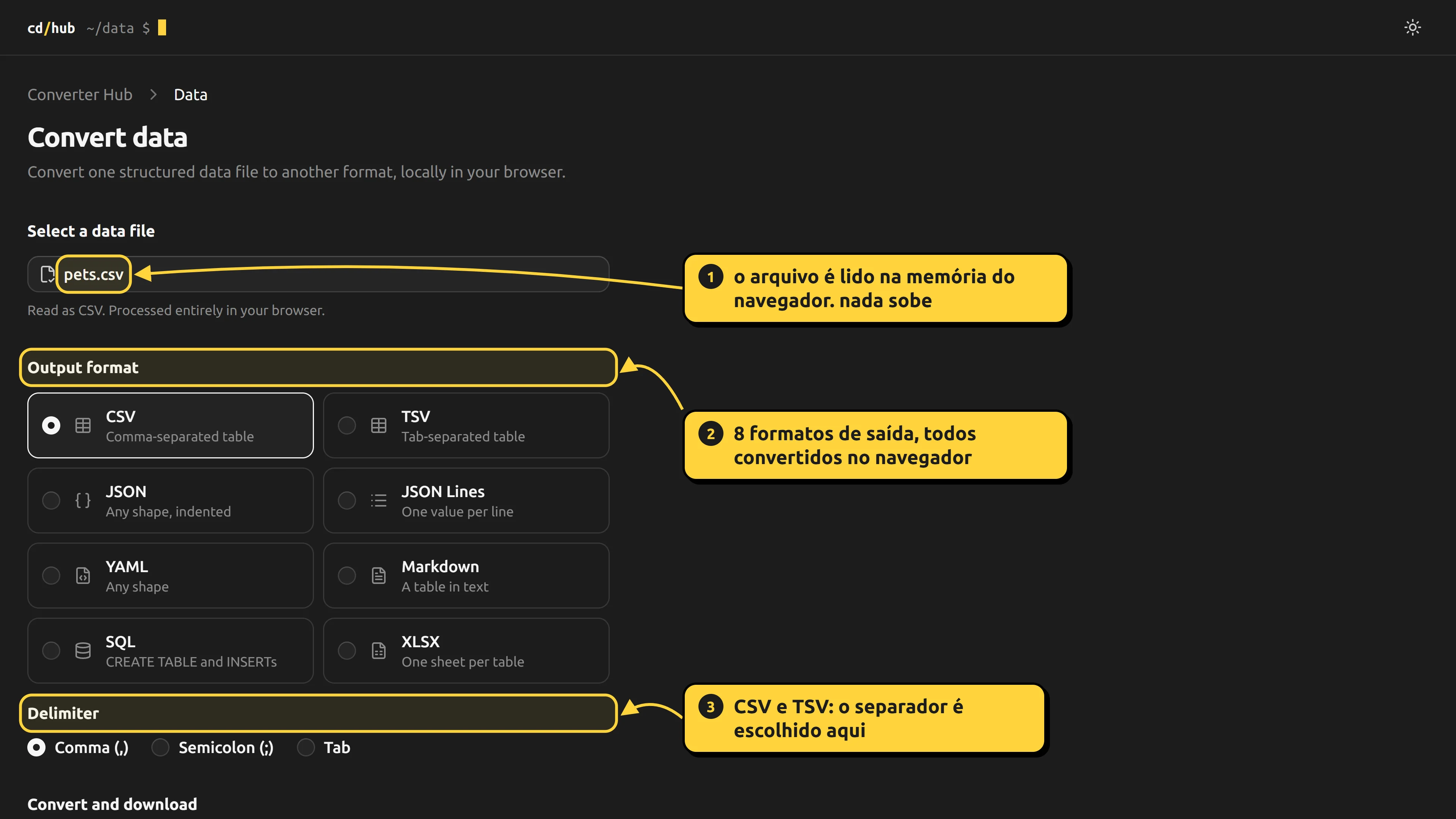
the script saves a PNG, and the file that goes on the site is a WebP, much smaller (this example is about 145 KB).
3. showing the screenshot the right way#
a sharp capture is pointless if a narrow text column squeezes it back down. so I changed three things in the portfolio.
the media breaks out of the column. the text sits in a 608px column, but the screenshot can be wider. a Tailwind utility centers the media and lets it grow to 1024px, without exceeding the screen width:
/* Mídia que vaza da coluna de texto (608px) até 1024px, centrada, sem passar da tela. */
@utility wide {
  position: relative;
  left: 50%;
  width: min(calc(100vw - 2rem), 64rem);
  translate: -50% 0;
}
the article's markdown becomes <figure class="wide">. the markdown component swaps the <img> for a figure with the wide class, inside a link to the original file:
img: ({ src, alt }) => {
  if (typeof src !== "string" || !localImage.test(src) || !existsSync(join(process.cwd(), "public", src))) return null;
  return (
    <figure className="wide">
      {/* O print é de uma tela inteira: clicar abre em tamanho real pra ler os detalhes. */}
      <a href={src} rel="noopener" target="_blank">
        <Image alt={alt ?? ""} className="block h-auto w-full" height={2160} quality={90}
          sizes="(min-width: 1056px) 1024px, 100vw" src={src} width={3840} />
      </a>
      {alt && <figcaption>{alt}</figcaption>}
    </figure>
  );
},
three details there:
sizestellsnext/imagethe picture is shown at 1024px on wide screens, so it serves a right-sized version instead of the full 3840px one for everybody;- the link around it opens the original file in a new tab, for people who want to read the small details;
localImageis a regex (/^\/projects\/[\w.-]+$/) that only accepts images under/projects/. the articles' markdown is my own content, but there's no cost in refusing outside URLs, and if the file doesn't exist at build time the image silently disappears.
what I learned#
- a screenshot is interface too. capture density, display width and original size are three different decisions, and the blur comes from getting any one of them wrong.
- annotating on the page beats annotating the image. positions come from the layout (
boundingBox), the text is text, and redoing a screenshot after the app changes is just running the script again. deviceScaleFactoris the sharpness knob. the layout doesn't change; only the pixel density goes up.- selectors by text and role survive change better than fixed coordinates. only the labels have coordinates (
at), and that's a design decision, not a layout one. - the reader needs a way out. even at 1024px, a 4K screen holds more detail than fits on the page, so clicking opens it at full size.
the portfolio's code lives at di0rio/portfolio-cd.